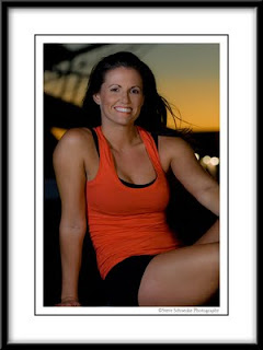
 Another image from the shoot with Kelly Crabb -- this one near sunset along the Galveston Ship Channel. The large out of focus structure in the upper left is the bowsprit of the Tall Ship Elissa. Strobist info: two SB800s fired from left and right, one with a small softbox (left), the other bare flash, both at 1/8 power. I only noticed this is postprocessing but the back of her upper left arm (below the out of focus lights) is backlit in red. There were some ship's navigational lights on the dock, and I believe this is where that came from. Not necessarily good or bad, just something I didn't notice when I shot it, but becomes obvious when you're working at 400% in Photoshop.
Thursday, October 22, 2009
Kelly Crabb #3
 Another image from the shoot with Kelly Crabb -- this one near sunset along the Galveston Ship Channel. The large out of focus structure in the upper left is the bowsprit of the Tall Ship Elissa. Strobist info: two SB800s fired from left and right, one with a small softbox (left), the other bare flash, both at 1/8 power. I only noticed this is postprocessing but the back of her upper left arm (below the out of focus lights) is backlit in red. There were some ship's navigational lights on the dock, and I believe this is where that came from. Not necessarily good or bad, just something I didn't notice when I shot it, but becomes obvious when you're working at 400% in Photoshop.
Subscribe to:
Post Comments (Atom)
That's what I'm talkin bout! Great job Steve.
ReplyDeleteWhat a wonderful smile she has!
ReplyDeleteI like the nice soft light on her face, and the subdued background exposure.
Can you give us the basic metadata, and say a bit about the process you used in setting exposure for the background versus the foreground? Did you chimp it in true Strobist fashion, or use an external flash meter?
In a perfect world, perhaps her shoulders could have been at more of an angle to the image plane.
Beautiful shot, Steve.
You have yourself a winner here.....I think you hit the mark. Great Job!
ReplyDeleteThanks for the comments guys. First, I used true strobist methods and chimped the shot. I set the original exposure for the sunset, then was lucky enough to guess the foreground exposure on Kelly at about 1/8 power from each of the SB800s -- 1/125 sec at f/5.6. Since it was so windy that night, we hesitated using umbrellas for fear they'd get blown off the dock, so I actually thought the light was slightly harder than I would've liked. The raw shot was slightly underexposed, but with a few tweaks in Adobe Camera Raw, it came right back range.
ReplyDeleteThis is a really nice exposure. You did a great job on the lighting here. I don't take issue with the red on her arm.
ReplyDeleteI have a small nit with the round lights. They tend to pull my eye a little more than I like.
If she wanted a strong look, the way you or she positioned her shoulders accomplished that. If that's not what she wanted, I would say next time to get the weight off her right arm so it doesn't give you that athletic or bulged arm. You could probably do the same with her left one (have her relax it).
In this pose she looks like she has swimmers arms. This is neither good nor bad. It all depends on what she or you wanted to convey to the viewer.
DHaass