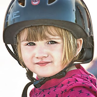
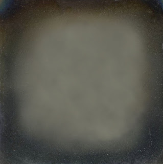
 There are two issues now in my mind: the lifeless skin tones and the blown out background. Whenever I have an image that is fairly ordinary I tend to think of adding texture and edges to give it a unique twist. Maybe it's a crutch I tend to lean on pretty heavily at times, but I've honestly found that sometimes those images that are the most ordinary are the best ones to texture. I think a better image stands by itself, but others take a few layers of texture to make stand out. So, layer #5: texture. I added the texture below thinking it might help the background. I cycled through the blending modes quickly, and surprisingly the one that I picked was color dodge (not one I use very often). And even more surprisingly, it wasn't the background that I liked here, it was how it interacted with the face. I thought it brought in some nice highlights to the hair, made the eyes pop with more green, and made the face somewhat porcelain, maybe with a slight yellow tint. All those things I thought were positive if I was going to take this into more of a crossprocessed, vintage look. The opacity was reduced to 83%, which made the background even more blown out...what can you do.
No comments:
Post a Comment