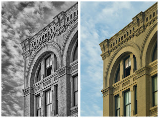
 This image probably epitomizes why I use Lucis Art. The photo was taken near the Strand in Galveston -- I think for the "Old Galveston" assignment for the Bay Area Photo Club within the last year. I feel both the sky and architecture really benefit from the Lucis Art treatment - and it was literally applied in one step, opening the shadows and amping up the clouds in one dialog box. My Lucis-ed version is on the left; the original out-of-camera version is on the right for comparison. In addition to Lucis, I also did some perspective correction and used Nik Silver Efex to do the black and white conversion. I've taken lots of photos over the last six years, since seriously jumping into digital, but this one somehow stays with me. It's, by far, not my best...probably wouldn't make any type of portfolio I would ever present. But there's something about it that lingers with me. I've studied it, printed it, but never presented it. And the more I think about it, it's probably the conflict here that appeals to me -- the corner office where a worker sits patiently doing his job for 30 years, while the world in all its glory passes by.
Thursday, July 23, 2009
Why I Use Lucis Art #5
 This image probably epitomizes why I use Lucis Art. The photo was taken near the Strand in Galveston -- I think for the "Old Galveston" assignment for the Bay Area Photo Club within the last year. I feel both the sky and architecture really benefit from the Lucis Art treatment - and it was literally applied in one step, opening the shadows and amping up the clouds in one dialog box. My Lucis-ed version is on the left; the original out-of-camera version is on the right for comparison. In addition to Lucis, I also did some perspective correction and used Nik Silver Efex to do the black and white conversion. I've taken lots of photos over the last six years, since seriously jumping into digital, but this one somehow stays with me. It's, by far, not my best...probably wouldn't make any type of portfolio I would ever present. But there's something about it that lingers with me. I've studied it, printed it, but never presented it. And the more I think about it, it's probably the conflict here that appeals to me -- the corner office where a worker sits patiently doing his job for 30 years, while the world in all its glory passes by.
Subscribe to:
Post Comments (Atom)
I haven't used either one of the programs mentioned, though I've seen a lot done with Nik Silver Efex Pro. I'm guessing the Nik program by itself would not have allowed you to get as much detail in the building?
ReplyDeleteDHaass
As always, I like the black and white version. I think it fits the building much better than the color version. I also think that it brings out the details in the building better.
ReplyDeleteGood job.