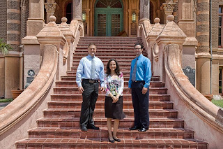
 As much as I like the effect Lucis has on architecture, it does some awfully strange things to skintones and natural creases in the skin. If there's any place you don't want grit and grunge, it's probably in the face. But you can always use a well-placed mask. This photo was taken a few weeks ago in front of Old Red on the UTMB campus, the oldest medical school building in Texas -- completed in 1891 and surivor of the 1900 Storm. Right now it's vacant and awaiting repairs from Ike, but it's a common backdrop for group photos. These three happy residents recently graduated from our plastic surgery program. I did this version with a Lucis Art layer masked only to the building, keeping the effect off the three people.
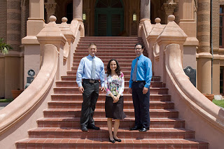
As per Shirley's request, here's the original image...

Nice job limiting the use of the tool to where you wanted it Steve! The Lucis application definitely adds interest to the building IMO!
ReplyDeleteWell done!
Barry
I would love to see the original photo here for comparison.
ReplyDeleteAs you know, I like to use nik Color Efex tonal contrast to do something a similar effect. I think the additional details really makes the subjects come forward.
ReplyDeleteNice job opening up the shadows Steve. It really helps complete the image.
ReplyDeleteLook great. I just discovered your blog. Now I will keep reading to see you work.
ReplyDeleteKris Gugliuzza