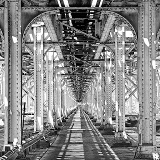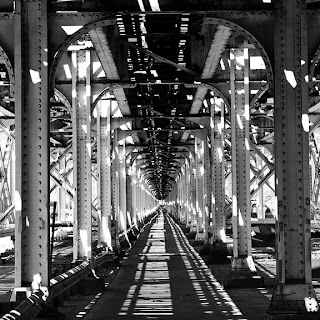
 After my first post in this series, I thought it might be helpful to see the straight out of camera version and the final Lucis version of these examples of why I use the Lucis Art plug-in. The photo at the top, here, is my final presentation version -- used for a high key assignment for the Bay Area Photo Club last summer. OK, so it wasn't the best choice for high key. But I think the before and after really shows how dramatically you can open the shadows in a photo with Lucis. The image was taken in Chicago, near Graceland Cemetery under the El tracks during the middle of the day. I didn't have a tripod and didn't want to spend alot of time making this shot because I had just spent a couple of hours shooting in the cemetery, and frankly I was pretty tired. I was literally walking to the El stop when I passed under the tracks, stopped and took 2-3 shots and moved on -- no brackets, no real thought of looking at the histogram -- I just knew I should take an "under the El" shot while I was in Chicago, and this seemed to be an OK view. Straight in, no real thought of composition, just raised the camera to the eye and knocked down the shot. I guess the fact that it was so high contrast made me think of pushing it toward high key, and ultimately brought me down the road of trying to open the dark shadows in this scene. I'll admit, cropping it square did wonders for simplifying the image. But in the end as I look back at my Photoshop file, my last layer in the 6-8 layer stack was a Lucis Art layer that just brought out incredible detail in the structure. So, why do I use Lucis Art #2? It absolutely makes architectural photos sing.
Lucis works well for this image. It definitely opened the shadows, does it also sharpen, or did you do that separately? I like the square crop here too. But also, I like the original version without the Lucis, it has more snap with the deep blacks and it seems somewhat simpler to me...I am not sure you have to have all the detail in the wood and the shadows to appreciate this image.
ReplyDeleteNot sure which one I like best. I think that they both have some interest. I think it depends on what you want to convey with the photo.
ReplyDeleteI still really like the position that you took to shoot this one.
Good job.
Steve, thank you for these posts. I look forward to your examples and the chance to learn about this plug in!! I really cannot take exception with either of these fine photos. They each serve a purpose. My preference is the original as I like the shadows but appreciate the finished one a a great example of the plug in. Thanks again for your time in doing this!
ReplyDelete