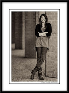
 Here's another photo of Alyssa. Unfortunately the weather turned pretty cold and rainy when were were shooting on Saturday, so we changed locations form the Strand to a covered area near the medical library on the UTMB campus. Sepia conversion was done with Nik Silver Efex, and in Photoshop I also did some minor perspective correction to the repeating columns in the background. Camera settings: Nikon D200, 85mm, 1/320 sec at f/1.4, off-camera flash from high and to the right - high speed sync to add to the limited depth of field I was going for.
Thursday, December 31, 2009
Alyssa #2
 Here's another photo of Alyssa. Unfortunately the weather turned pretty cold and rainy when were were shooting on Saturday, so we changed locations form the Strand to a covered area near the medical library on the UTMB campus. Sepia conversion was done with Nik Silver Efex, and in Photoshop I also did some minor perspective correction to the repeating columns in the background. Camera settings: Nikon D200, 85mm, 1/320 sec at f/1.4, off-camera flash from high and to the right - high speed sync to add to the limited depth of field I was going for.
Sunday, December 27, 2009
Testing Out a New Lens
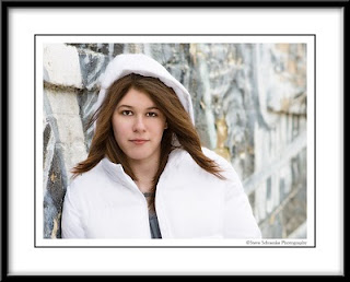 This is Alyssa, my second cousin once removed. She was patient enough to pose for some photos Saturday as I tested out a new lens on a cold, grey day down in Galveston. This was taken in the alley near 20th and Strand behind an antique car museum. They have this old painted mural on the wall that's seen better days -- lots of peeling paint, but it makes for an interesting background. Nikon D200, 85mm at f/2.0, off camera flash from the right, retouched in Photoshop with a final layer of OnOne's Phototools Jack Davis Portrait Glow at the end. I had the worst time exposing for her white jacket. I could never balance the exposure for both the face and jacket, ended up overexposing the jacket in the raw file. Thought I'd recover it in Camera Raw, which I did. But in the end, with the glamor glow effect, ended up blowing it out even more. But I like the effect. Goes to show you sometimes cameras are smarter than the dummies pushing the buttons.
Saturday, December 26, 2009
Renaissance Festival #3
 Here's another photo from the Renaissance Festival last month. This is Kat Denson, who I photographed last year with Larry in bright sun. We both thought the images we got from that session were pretty much unusable because of the harsh light. I attempted to salvage one of them and got surprisingly good results. I posted it on my blog a few months ago. Here's the link. This year, Doug and I photographed Kat as she danced as part of the Gypsy Dance Theater group. With changing light, lots of movement, and neither of us using flash, it was a difficult situation to shoot in. A food pavilion provided the background for this image -- 1/400 sec at f/3.2, +1 EV. In Photoshop I did some touchups to the background sky, also added a black and white layer in luminosity blending mode at 70% to add a little pop.
Monday, December 21, 2009
Renaissance Festival Violinist
 Here's another photo from the Texas Renaissance Festival. This woman is the violinist for the Gypsy Dancer Theater group that Doug and I photographed throughout the day. She is the mother of the little girl in my last two blog entries. From our vantage point for the performance, there were two good backgrounds to shoot against -- the gold-colored building that the young girl is shot against below and the trees behind one small part of the stage. This shot is the tree background. Decent bokeh here, but it's mostly obscured with my texture work -- three layers: sheet music, warm emulsion, and edge, all masked and blended pretty heavily to get the effect.
Soundtrack: Rufus Wainwright - Want Two
Sunday, December 20, 2009
Young Girl at Renaissance Festival #2
 Same image as the previous with some tweaks -- cropped a little tighter all around and especially from the top of the head. I also tried to shift the blue color of her blouse to more of a warmer color -- not as easy to do as I thought. Maybe it would be best to leave the blue color there. Just thought I'd give it a try.
Wednesday, December 16, 2009
Young Girl at the Renaissance Festival
 Some images that you capture haunt you. This one does that to me. Maybe it's because I don't have children, and I'm not around a lot of children, so there's something about the intense gaze of a child into my camera lens that intimidates me. I'm not used to seeing it through my viewfinder, and I'm a little uncertain how best to process it now that I've captured it. This young girl was one of the first people Doug and I met at the Renaissance Festival a couple of weeks ago. We were walking through the fairgrounds as the gates opened and came across her and her mother, who was the violinist in the Gypsy Dance Theater group that performed at the festival. We asked to take their photos, and the young girl seemed very shy, perferring to play with her doll than have her photo made. We took a couple of photos of them --- nothing too spectacular. About lunch time, Doug and I were in the audience as the Gypsy dancers performed, and during one of the breaks in the show this young girl came out onto the stage to collect donations. She leveled the look you see above at me, and I couldn't help but fire off 5-6 shots --- no flash, no posing, no composing a background.
First off, I got lucky with the background, which was a large gold-colored building that sold Greek food. Since light was constantly changing I was shooting at f/3.2, 1/400 sec, +0.7 EV with my 70-200 VR lens, just getting what I could out of a challenging situation. In postprocessing, I did some minor touchups to the background, took out some shadows under her eyes, brightened up her eyes a bit, and did some selective sharpening to the face and hair. I also added two layers at the end to warm the skin tones a bit, and I also put a black and white Silver Efex layer in at 36% opacity to add some contrast and depth. Now my question is this. What else should be done to this image? It's a starting point, but I don't feel it's final. A couple of things I thought about doing were: 1) to go ahead and crop into the top of the head and 2) to color shift her blouse from blue to yellow/gold to make the image more monochromatic. Like I said at the beginning, this one haunts me. I like the shot. I just don't feel 100% comfortable postprocessing images of young children. Any suggestions are welcome.
Tuesday, December 15, 2009
Mission San Jose
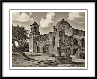 I'm finishing up my San Antonio Missions project for our friends -- six framed prints for their home. I received the prints from mpixpro.com last night, and they came out great. So I thought I'd post some to the blog. This is Mission San Jose photographed in August. I remember how blazing hot it was that day, and now a few short months later we've had four straight days of fog and 50 degrees.
Sunday, December 13, 2009
Dickens on the Strand #2
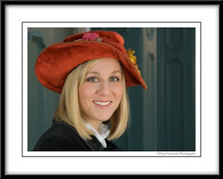 This photo was taken at Dickens on the Strand last weekend in Galveston. Larry and I photographed this same woman last year while she was working in a booth, and we both were unhappy with our results. We both tried our hand at salvaging an image. Mine was posted on this blog here in May. Basically the booth background ended up being too distracting for anything really usable. This year, we saw her along the Strand and were able to move her into a neutral background. This was shot with two softboxes against a wall on 23rd and Strand. And while this photo didn't do very well at our photo club meeting last week, I was happy to get a decent portrait of this woman ... a year later.
Wednesday, December 9, 2009
Renaissance Festival #2
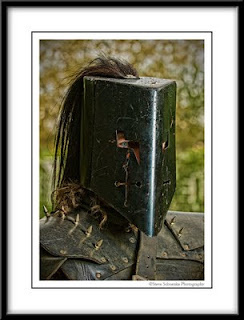 Far from my best shot at the Renaissance Festival, but this one has an interesting story. Doug and I met these two guys in armor and of course wanted to photograph them. He was up first and got to shoot the bright silver one; I on the other hand, got the guy in full black armor. What luck. After a couple of shots in shade and almost giving up, I moved him into a little bit of sun. Still dark on my LCD I shot another 3 or 4 shots, but I didn't really have much hope for any of these images. But I needed to get a decent image to the guy under the helmet here, so I went to work in Photoshop. This is where Topaz Adjust really saved this shot. It opened up the shadows and added some nice texture to an otherwise bland and dark image. After Topaz, I realized how hard the camera was working here despite the dark subject and background. Note how sharp the eye is even through the helmet, and the background is really rendered pretty nicely. I have no idea how a catchlight ended up in the eye with all that mask in front. As I remember it, Doug was off camera right with the flash. Goes to show you no matter how badly things look on the LCD, there is still decent data being captured on that sensor.
Tuesday, December 8, 2009
Lauren #6
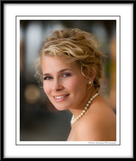 After all we put Lauren through a few weekends ago in awkward places and nontraditional poses at our trash the dress photo shoot, I thought it would be nice to do a very simple head and shoulders portrait of her. This image was taken during a little break in shooting as we waited for the sun to change positions. She was sitting on the street curb right in front of a bright red fire hydrant. I asked her to lean forward to get a small piece of the hydrant out of the frame, and with Mike providing some fill light from the left I took about a dozen shots at f/2.8. The background that became out of focus here is the sidewalk awning of an old department store on Postoffice Street, which was about 20-30 feet away. I also did my basic 10-minute beauty retouch here -- smoothed and refined the skin, brightened the eyes and teeth, and did some selective sharpening of the eyes, mouth and hair. The background is pretty much untouched.
Sunday, December 6, 2009
Dickens on the Strand #1
 This weekend was Galveston's annual Dickens on the Strand Festival, where many dressed in Victorian costumes. These two characters have been there as long as I can remember -- Jacob Marley (from Dickens' A Christmas Carol) and Father Christmas. We thought they made a nice pair and took a couple of portraits of them. As things worked out Saturday we ended up with two softbox lights, so many of my photos from Dickens will be the usual set up plus an additonal light. One big advantage we found having another light in the mix was the ability to put some light under the brim of someone's hat while having another to light overhead. Fun as always; Larry Patrick, Doug Haass, and I stalked many with our lights on sticks and cameras. This particular shot has a bit of a twist. As fast as we try and work, I knew I couldn't carry the focus on both characters faces with one shot, so I quickly took two in sequence with each character in focus. This is the resulting image, where they have been combined in Photoshop.
Friday, December 4, 2009
Lauren #5
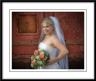 Another shot from the trash the dress photo session with Lauren a few weeks ago. This one against the great red doors we found in the Galveston alley. Ambient lighting was very heavy from off camera left, pushed a little further with some fill flash from that same side. In postprocessing, lots of vignetting was added that I think added to the lighting and gave the image some pop and drama. Nikon D200, 1/45 sec at f/4.
Tuesday, December 1, 2009
Renaissance Festival #1
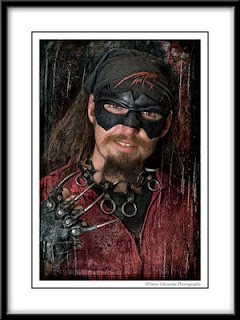 Steve Schuenke's rule #1 for postprocessing Renaissance Festival images --- don't be wimpy. Throw the kitchen sink at an image and pull back the layers to see what's left. That's just about what I did with this image of a vendor selling metal claw gloves at the Texas Renaissance Festival. Doug Haass and I went to the festival on Saturday, taking impromptu portraits of anyone who we thought would make an interesting subject. Like my trip shooting there last year with Larry Patrick, we used a flash on a paint stick shot through a small softbox triggered with Alien Bee remotes. It makes for a nice set up -- very lightweight and flexible. You can put light under someone's hat, overheard for more of a beauty look, or across the face for drama. In fact, I've found shooting like this -- when you have about 2 minutes to evaluate the subject, pick a background, figure out some kind of lighting, and then take a couple of photos -- is probably one of the most challenging and rewarding kinds of photography. You never know who you're gonna meet and what you will bring home on a memory card, but you will learn how to light.
My kitchen sink of layers here included: Topaz Adjust, a couple of great scratched textures, and quite a few curves adjustments to add some depth and dimension.
Subscribe to:
Comments (Atom)