
Monday, August 30, 2010
Friday, August 27, 2010
Tuesday, August 24, 2010
Saturday, August 21, 2010
Wednesday, August 18, 2010
Monday, August 16, 2010
Chelsea in High Key
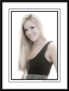 Sometimes you throw a lot at an image -- lots of layers, textures, and Photoshop plug-ins. I know. I've done it. Maybe you're trying to make something out of nothing, which is most likely the case. It can be frustrating. Other times you just let an image live the way it is supposed to look -- like this photo of Chelsea taken Sunday afternoon. I've photographed Chelsea twice now, and I've been lucky enough to get to know her a little. In every portrait I think the photographer should try to capture their subject's spirit. And I think this one does -- smiling, easy going, care free, young and beautiful.
Larry, Doug, and I tried to capture that yesterday, and I think we were successful. We threw up lots of light stands and worked with lots of gear, but when you strip all that away ... all the floundering around with equipment and all the technical issues and missteps ... and you come out with something you feel embodies the subject, well I think that's a success. I'll probably crop this image a little at the bottom ... some day. But for now it will live on my hard drive the way it is. Because when I think of Chelsea, this is how I picture her.
Sunday, August 15, 2010
Photo Club Portraits #3
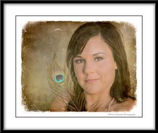 Another photo from the Bay Area Photo Club portrait field trip in late July. This image is of Kristin. I brought the peacock feather with me to use as a prop, and since she was one of the first subjects I shot, I thought I'd try it. In postprocessing, I added the vintage overlay and toned the image slightly -- thought it helped the overall feel of the photo. Nikon D200, 80mm, f/5.6, 1/250 sec, light from the Elinchrom Quadra high right.
Wednesday, August 11, 2010
Photo Club Portraits #2
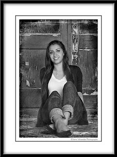 Another photo from the Bay Area Photo Club field trip a few weeks ago, this one of Danielle by herself. The door in the background was bright red, and I had mixed thoughts about that. Ended up settling on a black and white just to even things out and take that strong color out of the background. The door handle is also an issue -- thought about cropping it, but it just looked odd to have half a handle in the background. A lot of other layers mixed in here in addition to the Silver Efex black and white -- some Lucis and my latest discovery -- Flypaper Textures fly edges package. Like I need more textures.
Nikon D200, 62mm, 1/200 sec at f/7.1. Flash from the Elinchrom Quadra from high camera right.
Saturday, August 7, 2010
Photo Club Portraits #1
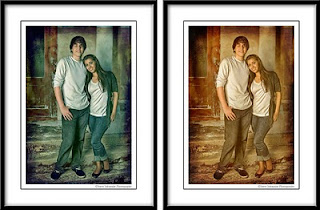
Two weeks ago the Bay Area Photo Club held a portrait shoot. We had several groups of models and several shooting stations with various lighting setups. We rotated the models into different locations, and I was stationed on the front steps of an old railroad warehouse in Galveston. This is Danielle and Eric -- recent high school graduates and both heading to college in the fall. The original image was shot with an Elinchrom Quadra and softbox coming from camera left. But even with that great light, I felt compelled to enhance this a bit. Since I've been using Topaz Adjust I've all but left Lucis Art on the shelf, but I find myself coming back to my old Lucis friend these days. It has a different punch than Topaz. Hard to describe. So I ran Lucis and masked it off their faces and all visible skin. Then went to town with some textures and edges. Originally I had the textures headed in the warm direction (right), but decided to try a cool version (left) and ended up liking it better. Let me know what you think...
Thursday, August 5, 2010
Untouched by Photoshop #3
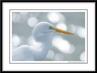 Great egret captured near shrimp boats in Galveston. The more I shoot birds the more likely I find myself shooting shallower depth of fields. I guess I feel a little more confident in my focusing or maybe since I shoot birds less often than I did a few years ago I tend to take more chances -- panning, shooting at f/2.8, etc. This one is straight out of camera, just a little white balance tweak in Adobe Camera Raw. Nikon D200, 200mm, 1/2500 sec at f/2.8, +1.7 EV.
Monday, August 2, 2010
Untouched by Photoshop #2
Subscribe to:
Comments (Atom)


