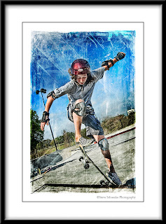
 In my day-to-day work as a graphic artist at a medical school, I normally have strict guidelines and rules to follow for images. After a long day of straight lines and predictable outcomes, sometimes it's nice to color outside the lines. Photo taken this spring at the Jamail Skate Park near downtown Houston. Emulsion overlays added courtesy of Caleb Kimbrough from his wonderful bitbox blog. Nothing shakes me out of the graphics doldrums better than throwing some textures on a photo and working fast and loose to create something really unique.
Tuesday, September 29, 2009
Outside the Lines
 In my day-to-day work as a graphic artist at a medical school, I normally have strict guidelines and rules to follow for images. After a long day of straight lines and predictable outcomes, sometimes it's nice to color outside the lines. Photo taken this spring at the Jamail Skate Park near downtown Houston. Emulsion overlays added courtesy of Caleb Kimbrough from his wonderful bitbox blog. Nothing shakes me out of the graphics doldrums better than throwing some textures on a photo and working fast and loose to create something really unique.
Sunday, September 27, 2009
Emulsion Edge
Since there was some interest in the emulsion edge I used for the Shelley Boozer image below, I decided to reconstruct it at full resolution. If you'd like to use it, I posted it over at flickr -- follow this link.
Monday, September 21, 2009
One of a Kind Image
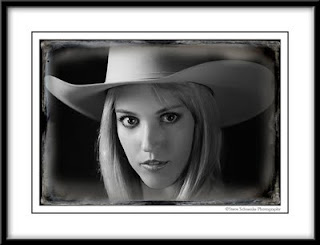 I'll never be able to duplicate this photo exactly as it appears here -- and that's frustrating. I began working on these six-month old images over the last few weeks. They were taken at the Popular Photography Digital Days model shoot in March. I considered this a work in progress, and resized it and flattened it so I could take a look at a low-res print just to see where some retouching still needed to be done. After I did the downsize, I wondered what a texture would look like ... and after about 15 minutes of layers, masks, and dodging & burning I came up with what you see above --- only I did it all on a flat, low-res file. I guess I can go back and try and reconstruct it if I ever want a high resolution print of this file. It's frustrating though, because I like the edge. I think it fits the subject. So, add one more thing to my list of things to do: reconstruct emulsion edge that I stupidly did on a 96 dpi image. Sometimes you learn the hard way.
Thursday, September 17, 2009
Back to the Missions
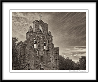 I'm beginning work on the series of San Antonio Missions photos for our friends. I put a bunch of my selects on Flickr for them to look through, and they picked a couple of finalists from each mission. This is Mission Espada. Funny, I would have never picked this particular frame to work up. Not that it's bad, but this was one of my early images out of the gate -- taken with backlighting, no bracketing, and a wedding procession going on just below the bottom edge here. But as I studied it, I saw some potential here --nice ribbons of clouds in the upper right and with a little cropping there is a certain amount of majesty that seems to come through. It just goes to show you, as much as we edit our work and constantly refine our workflow, sometimes it takes an impartial eye to see what we often overlook. Lucis Art was used to bring up the contrast in the sky. A black and white Nik Silver Efex layer in luminosity blending mode was added to further enhance the sky. The final layer was a Nik Silver Efex sepia layer.
Thursday, September 10, 2009
Digging Back in the Archives
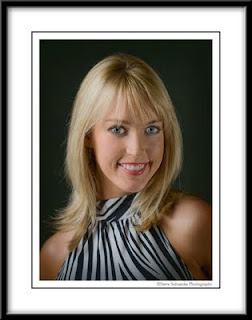 This photo of model/actress Shelley Boozer was taken about six months ago at the Popular Photography Digital Days model shoot in Houston.
Short memory. That's what happens alot to me when it comes to postprocessing my photos. I move on to the next project or get caught up with a new technique and leave decent images sitting on a hard drive. Nothing's more satisfying to me as a photographer/retoucher than when you find that long forgotten image buried in a folder of photos taken months ago and bring it to the surface and get a printable image from it.
After a nice retouch of the eyes and skin, what really made this image pop was a Nik Silver Efex layer put into luminosity blending mode at about 60%. The Silver Efex layer? Antique Plate I. Go figure. This doesn't exactly have the appearance of "antique." But it never ceases to amaze me how creatively you can use black and white and sepiatone layers with various blending modes to impart selective glow and shadow and really give impact to an image.
Tuesday, September 8, 2009
Soft Focus Sunflower
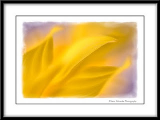 Sorry for the long absence posting new photos over the last several weeks -- I've had internet issues and frankly I've been enjoying taking a little bit of a break. But all seems well with my internet connection, so I'm back to the blog. This image is a continuation of a personal project I've been working on for about seven months -- using extension tubes with a 50mm lens, which essentially makes it a macro lens. By using the extension tubes, you get very soft focus backgrounds. This is a sunflower shot with two off-camera strobes. The ambient background was kind of muddy grey, so I shifted it slightly purple which I thought made a nice color combination with the yellow/orange flower. The edge was added with an OnOne Photoframe preset.
Tuesday, September 1, 2009
Mission San Juan
 More experiment than anything else, this is Mission San Juan with texture added mostly around the edges. Probably not the best way to postproduce the series. The texture seems to impart some color cast to the image overall that was difficult to take out. Again, I'm still trying to get a handle on blending texture with real photo; and deep down I feel that age and texture are appropriate for these images, but feeling my way on how best to integrate it. Maybe sepia tone, then texture. Feel free to comment.
Subscribe to:
Comments (Atom)