Sunday, October 11, 2009

In the Trenches #6

OK, I really need to do something about the background. And I can't help but think this texture is the right one for the job. Layer #6: texture again. I cycle through the blending modes with the identical texture -- this time with the previous color dodge layer in the mix, and hard light mode catches my eye. I think it definitely accomplishes what I'd like for the background, brings your attention to the face, and brings the yellow tint to the face back to more of a semi-realistic warm shade. So, I use this layer at 100% in hard light blending mode. Interesting that I don't mask the texture below at all on either layer I've used it on ... and both blending modes are ones I don't use very often. They seem to add some nice highlights and toning to the face while taming the harsh background ... and no masks whatsoever. Amazing.


Saturday, October 10, 2009

In the Trenches #5

There are two issues now in my mind: the lifeless skin tones and the blown out background. Whenever I have an image that is fairly ordinary I tend to think of adding texture and edges to give it a unique twist. Maybe it's a crutch I tend to lean on pretty heavily at times, but I've honestly found that sometimes those images that are the most ordinary are the best ones to texture. I think a better image stands by itself, but others take a few layers of texture to make stand out. So, layer #5: texture. I added the texture below thinking it might help the background. I cycled through the blending modes quickly, and surprisingly the one that I picked was color dodge (not one I use very often). And even more surprisingly, it wasn't the background that I liked here, it was how it interacted with the face. I thought it brought in some nice highlights to the hair, made the eyes pop with more green, and made the face somewhat porcelain, maybe with a slight yellow tint. All those things I thought were positive if I was going to take this into more of a crossprocessed, vintage look. The opacity was reduced to 83%, which made the background even more blown out...what can you do.

Friday, October 9, 2009

In the Trenches #4

After two very destructive layers to bring up the exposure and sharpness, this is Layer #4: cloning and touch-ups. This is normally one of my first layers, but I guess when you have a shot so soft and poorly exposed as this one those issues take precedence. I merged the existing layers together on a new layer (Control, Alt, Shift, E) and touched up the blemishes around the mouth, a couple of stray hairs on the cheek, and got rid of those awful shadows under the eyes. It's tricky touching up a portrait of a child. You hate to make this into too much of a glamour shot on such a young subject, but at the same time for me as a retoucher there's a minimum amount required. I tried to keep that in mind here -- no selective brightening or color shifting, just cloning to get rid of distractions. What starts to enter my mind here is that after Topaz, sharpening, and now retouching, I'm left with skin tones that are somewhat lifeless -- somehow the warmth has been lost. And while the face has improved the background is still blown out. Still a long way to go.

Thursday, October 8, 2009

In the Trenches #3

Those shadows under the eyes are really bothering me now. But similar to the way an oncologist works with chemotherapy, I work destructively before I start building things back in -- Layer #3: Sharpening. OK, I never sharpen this early in a workflow, but this image was so soft and so exposure-challenged that I just dove right in here. In the back of my mind, I was thinking this was the critical step, and right away sharpening would tell me if this image had any future or not. Layer added with a generous Unsharp mask, normal blending mode, 100% opacity. Mask below for reference. There's enough sharpness here (eyes and the hair along the cheek) that I feel it's worth continuing. But sharpening on top of Topaz has put some pretty awful ruts in the face. Still not a printable image, but maybe it's sharp enough for onscreen.


Wednesday, October 7, 2009

In the Trenches #2

Since I just got Topaz Adjust, that seemed like the place to begin -- Layer #2: Topaz Adjust. A former boss used to say, "when you only have a hammer, everything starts to look like a nail;" Photoshop corollary: when you just bought Topaz Adjust, every image looks like it needs its shadows lifted. Honestly, I think it did a reasonable job brightening the face; but similar to Lucis Art, random bits of unattractive ruts and creases appear. Note dark circles under the eyes. Yikes. At this point I'm still seeing this image as a Topaz test rather than anything worth keeping. I added a mask and applied it selectively mainly to the face and helmet, also decreased the opacity of the layer overall to 73%. For reference, the mask is below. Again, nothing too spectacular, still working fast and loose.


Tuesday, October 6, 2009

In the Trenches #1

As promised, here's my base image I'm going to be spending the next seven consecutive days posting about. As bad as it looks, note that this is after some Adobe Camera Raw tweaks, so it was pretty horrible straight out of camera -- white skating surface with backlighting behind a face hidden in a helmet -- no flash, no HDR. There's a fair amount of fill applied here in ACR just to get it to this point. It was chosen to test Topaz Adjust, a relatively new Photoshop add-on that can be used to heighten contrast and bring out shadow detail ... and as you'll see later in the week, it did a pretty good job with this image. But you'll also be seeing how blending modes can be used to key shift an image into a completely different color range. You'll also see my workflow -- masks, textures, and all. Feel free to comment as we go -- not necessarily about the image but about my workflow and thoughts about what direction you'd want to take the image on each post. No fancy gallery frames on these photos -- this is going to be down in the trenches Photoshop work. Oh, and by the way, go ahead and click the image to see a larger version. As if this image didn't have enough problems, it's probably one of the least sharp I've ever taken.

Into the trenches we go.

Monday, October 5, 2009

Girls

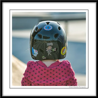
This photo was taken in the spring at the Jamail Skate Park near downtown Houston, and it really has no place on this blog. It's not a great photo, but there's a couple of things about it I really find funny -- more on that later. I recently decided to try Topaz Adjust and see how it compared to my beloved Lucis Art plug in. After a couple of weeks of demo, I decided to buy it and wanted to put it through its paces so I intentionally chose some very difficult exposures to throw at it this past weekend. This image, being backlit, was a good test. I was able to recover decent amounts of detail in an otherwise underexposed shot. But now for the funny parts -- and these were things I would have never noticed if I hadn't spent a few minutes with this photo. If you look closely at this little 4-year-old girl, you'll see she's wearing a pink and black skull-n-crossbones shirt. OK, someone has a sense of humor. Second, there's a Bucees sticker on the back of her helmet -- the beaver logo. Now, if you haven't experienced Bucees, it's like the Disney World of rest stops. I stopped at one on the way to San Antonio in August, and I was amazed. It's the place to be for all your "on the road needs." And third (and this I find especially funny), if you look at the "Girls" sticker in the center and scan directly up -- well, those two guys sitting there are yours truly and Larry J. Patrick. That "Girls" caption for us is just so appropriate as we sit there with our expensive cameras as the 4 year old contemplates the skate park maze. Shortly after this shot was taken, this little girl turned around and I took a photo of her face. Tomorrow, I'm going to start a series of my edits of that photo. Again, it was backlit so my intent was to salvage only, but I discovered a couple of interesting things about blending modes in the process ... just like I discovered a couple of humorous things about this image that most would have deleted on the spot. Sometimes you have to spend a few moments with an image to really notice the subtle details -- funny or otherwise.